Visual Guide: The Anatomy of a High-Converting E-commerce Checkout (15 Must-Have Elements)
🛒 Introduction: The $18 Billion Problem
Imagine owning a physical retail store. Ten people walk in, fill their carts with products, walk up to the cashier, and then seven of them suddenly drop everything and walk out the door without paying.
This sounds absurd in the physical world, yet it happens every second online.
The average shopping cart abandonment rate hovers around 70%. That means for every $100 you could make, you are only collecting $30. The primary culprit? A friction-filled, confusing, or untrustworthy checkout experience.
At Webtirety, we build high-performance e-commerce solutions both custom builds and via our Nexus and Aeropos ERP SaaS platform. We’ve analyzed millions of sessions to understand exactly what makes a user click “Pay Now” versus closing the tab.
We have distilled that data into this visual guide: The Anatomy of a High-Converting Checkout Page.
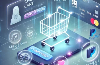
📊 The Infographic: 15 Elements of a Perfect Checkout
Below is a visual map detailing the 15 critical elements required to reduce friction and build trust during the final few seconds of a transaction.
🔗 Share This Image on Your Site
Please include attribution to Webtirety.com with this graphic.
HTML
<textarea style="width:100%; height:100px;" onclick="this.focus();this.select()" readonly="readonly">
<a href="https://webtirety.com/dispatch/high-converting-ecommerce-checkout-infographic/">
<img src="https://webtirety.com/dispatch/storage/sites/4/2026/02/Infographic-showing-15-elements-of-high-converting-e-commerce-checkout-page-design.jpg" alt="The Anatomy of a High-Converting E-commerce Checkout Infographic by Webtirety" width="800" border="0" />
</a>
<br />Source: <a href="https://webtirety.com">Webtirety Software</a>
</textarea>
🧭 Deep Dive: Breaking Down the Anatomy
A pretty design doesn’t guarantee sales. A functional design does. Let’s break down why these 15 elements are critical for e-commerce checkout optimization.
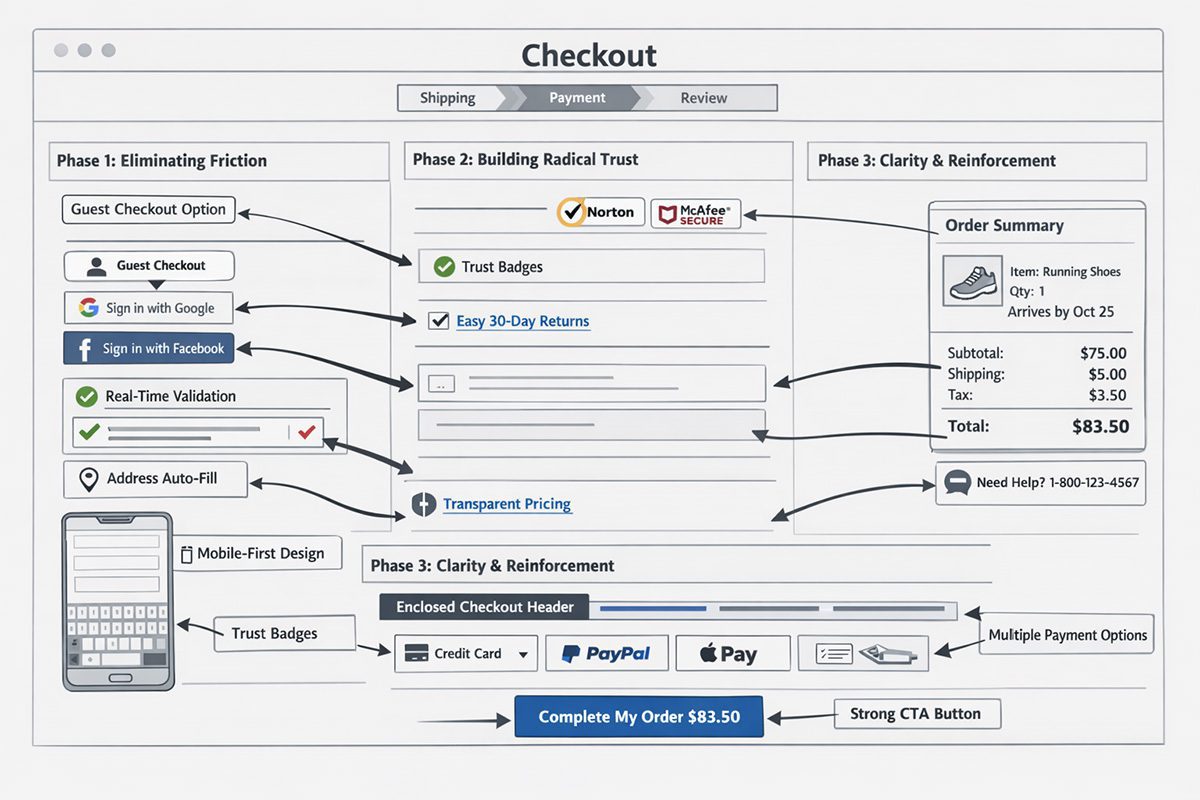
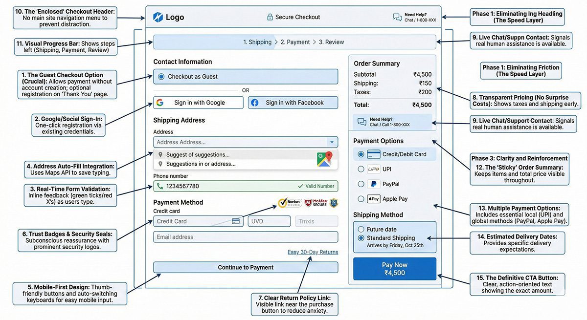
Phase 1: Eliminating Friction (The Speed Layer)
The number one reason for cart abandonment is being forced to create an account.
1. The Guest Checkout Option (Crucial): Never force registration upfront. Allow users to pay first, and offer account creation as an optional step on the “Thank You” page.
2. Google/Social Sign-In: If you must ask for an account, allow one-click registration using existing Google or Facebook credentials.
3. Real-Time Form Validation: Don’t wait until the user clicks “Submit” to tell them they missed a digit in their phone number. Use inline validation (green ticks/red X’s) as they type.
4. Address Auto-Fill Integration: Use Google Maps API or similar tools to auto-complete addresses. This saves mobile users huge amounts of frustrating typing.
5. Mobile-First Design: Over 60% of traffic is mobile. Your checkout buttons must be thumb-friendly, and keyboards should switch automatically (e.g., showing a number pad for credit card entry).
Phase 2: Building Radical Trust (The Security Layer)
Customers are handing over sensitive financial data. If your page looks sketchy, they are gone.
6. Trust Badges & Security Seals: Display prominent Norton, McAfee, or SSL certification logos near the credit card fields. This subconscious reassurance is vital.
7. Clear Return Policy Link: Don’t hide it in the footer. Place a small link near the “Place Order” button to reduce purchase anxiety (e.g., “Easy 30-Day Returns”).
8. Transparent Pricing (No Surprise Costs): Show taxes and shipping costs early. Unexpected costs at the final step are the second biggest reason for abandonment.
9. Live Chat/Support Contact: A small “Need Help?” icon or phone number signals that there are real humans behind the website in case something goes wrong.
Phase 3: Clarity and Reinforcement (The UX Layer)
Never let the user forget what they are buying or where they are in the process.
10. The “Enclosed” Checkout Header: Remove your site’s main navigation menu during checkout. Don’t give users an escape route to click away to your blog or “About Us” page. Keep them focused on paying.
11. Visual Progress Bar: (e.g., Shipping > Payment > Review). Humans need to know how many steps are left. A 3-step process feels manageable; an endless form feels exhausting.
12. The “Sticky” Order Summary: As the user scrolls down the form, the summary of what they are buying (product image, total price) should remain visible on the side.
13. Multiple Payment Options: Don’t just offer Credit Card. In India, UPI is essential. Globally, PayPal and Apple Pay are becoming standard requisites for a modern payment gateway.
14. Estimated Delivery Dates: Don’t just say “Standard Shipping.” Say “Arrives by Friday, Oct 25th.” Specificity manages expectations.
15. The Definitive CTA Button: Avoid vague button text like “Continue.” Use clear, action-oriented text like “Pay Now ₹4,500” or “Complete My Order.”
Conclusion: Great Checkouts are Invisible
The goal of checkout design isn’t to be noticed; it’s to be effortless. When a checkout process is optimized, the user doesn’t think about the forms they only think about the product they are about to receive.
If your current e-commerce site is suffering from high abandonment rates, it’s likely missing several elements from this anatomy.
Whether you need to optimize an existing WooCommerce/Shopify site or require a robust, custom e-commerce architecture that handles thousands of concurrent transactions, Webtirety has the expertise to turn your checkout page into a conversion engine.
Is your checkout bleeding revenue? > Request a Free E-commerce CRO (Conversion Rate Optimization) Audit
❓ FAQ: E-commerce Checkout Optimization
Across all industries, the average cart abandonment rate is approximately 69.57% (source: Baymard Institute). This means roughly 7 out of 10 shoppers leave without completing their purchase.


I’m Manas Ranjan Sahoo: Developer/Founder of “Webtirety Software”. I’m a Full-time Software Professional and committed to expanding Webtirety Software into a thriving platform that empowers businesses and individuals alike. I love to Write Blogs on Software, Technology, eCommerce, SEO, and Digital Marketing.